Monday, April 24, 2017

A Semester of Advertisements

This semester I took a Writing for Advertising class (and absolutely loved it, might I add). 
For my final, I had to put together a portfolio of different types of advertisements that I made.  The creation of this portfolio took up my entire Saturday...I actually took my computer to a school lacrosse game since the pep band that I am a part of was playing.
Even though this project consumed most of my weekend, I am 100% satisfied with how it turned out. Here are three of my personal favorites:

This ad was a print ad intended to go in magazines and hung as a poster for Guitar Center.

This ad was for one of my interactive concepts.  It would be for Eddie and Sam's pizza in Tampa, FL.  The concept is an online game where you make a pizza, and when you are done, you input your email address and they send you a coupon.

This was another print ad for a shoe company called Allbirds.  This ad would also be a poster, and is meant to show that Allbirds shoes are made in New Zealand, using sheep wool, while not harming the sheep.

Thursday, February 16, 2017

Sorry It's Been A While Here Are Some Sad Puppies

I'm back!
I know it's been a while since I've uploaded anything on here, but I've just been super crazy busy.
This semester I will be uploading some advertisements that I make for my Writing for Advertising class, as well as any other projects I find the time to do.
So as a "I'm back" post, I apologize because these ads are really kind of sad.  
For this project I had to create an advertising campaign for a social issue that I am passionate about, so I chose to focus on a company that encourages people to adopt shelter animals.  The company, Pawz Shop, sells clothing and accessories, and donates 10% of all net profits to this cause.  Their goal is to help stop the euthanizing of shelter animals.
My ads are super sad, and I apologize for that, but I think they are also effective.
If you want to check out the website for Pawz Shop, click here or follow the link below:

https://pawzshop.com


Tuesday, December 13, 2016

I Am A Queen...

For my final project in my ART211 class, we were supposed to make a deconstruction video.  From what I understood, a deconstruction video is a video that is supposed to make you think or question an idea.  I made mine feminist.
In my video, I layered a recording of my own voice with a background beat from GarageBand, and played it over a photo montage of myself from when I was little until just as recently as this past Saturday.
When watching this video, please excuse my voice, as I have had a frog stuck in my throat for weeks since Thanksgiving and so my voice is a bit shaky.  
I consider this a deconstruction video because of the juxtaposition between the angry and upset tone the audio gives off, with the pictures of me smiling and beaming from my accomplishments.  The point of this is to make you think.  I believe this video does that.
In the audio, I am talking about how society thinks.  While the opinions I express obviously do not apply to everyone, the fact of the matter is that women are objectified every single day.  Men believe that women dress for them, go out to gain their attention, and wear makeup for them.  In reality, women dress however they want to dress because they want to, not for men to stare at them and lust after them.  Women go out to have fun, not to have men hit on them.  Women wear makeup to make themselves feel beautiful and more confident, not for the viewing pleasure of men.  
As a society, we need to stop objectifying women, and realize that women are people too.  Instead of treating them like living barbie dolls, why don't we treat them like actual human beings.
Enjoy my video.


Friday, December 2, 2016

Bang That Drum

For a super special project that I did for someone personally, I edited some drum pictures, and I think a couple of them turned out pretty awesome!
I made 12 edits in total, and after having Photoshop crash more than one time, you could say I was more than a bit frustrated, but I think these ones made the frustration worth it.


Tuesday, November 29, 2016

You're Beautiful

For my performance art piece, I had an extremely difficult time coming up with ideas.  I am not one to do anything out in public with the end goal of getting reactions from people, so I was kind of dreading this assignment as soon as I learned about it.
That being said, I had the hardest time coming up with something to do.  Every time I Google or YouTube searched performance art, the examples were from professional artists, and were all so 'out there' that there was no way I could picture myself doing something like them.
Eventually, I came across a video by YouTuber Shea that she made about a year ago.  She went around to her friends and classmates asking to take pictures of them, and told them she was taking pictures of things that she thought were beautiful.
Now this was something I could do.
Because this was not my original idea, I sent an email to Shea explaining what I was supposed to do for this piece, and asking permission to use her idea.  A screenshot of my email is attached below.  I had a backup plan in case she did not get back to me in time (I decided to do this on Sunday night...the project was due in less than 48 hours...) or decided that she did not want me to use her idea, but she replied to my email before I did my project, telling me that I could use her idea, and to simply send her the link to my video when I was done.  Her response is also attached below.
After hearing back from her, I grabbed my camera and headed across the street to Curtis Hixon Park and the Tampa Riverwalk.  At first I was hesitant and did not want to approach people to ask to take their picture..I mean, these were complete strangers!  However, with an encouraging push from my videographer (literally) I was able to work up the nerve and ask people if I could take their pictures for a school project (and I would like to think that as I went along I became more comfortable, but lets be real, talking to strangers is not my strong suit).
Anyways, some of the reactions I got were priceless!  I would hold up the camera (if they agreed) and tell them that the point of the project was to take pictures of things that I thought were beautiful.  Someone cried, another laughed and smiled, some had no reaction, and one simply did not want me to take her picture.
While I wasn't really 'performing' per say, I did get a reaction from those who I approached.
Please enjoy my video!  It's not my best work, but like I said, the idea came to me with less than 48 hours to actually do my performance art, upload and edit the video so that it is less than 3 minutes, and upload it here on my blog.
I hope you all enjoy!
STAY BEAUTIFUL!

My Email

The Approval

If you are having trouble opening the video, try clicking here

Friday, November 25, 2016

We Got The Beat

For this assignment, we had to research different music movements and add another artist to said movement.  We were supposed to do this with five different movements, and obviously explain why we chose to add the new artists in.  Hopefully some of the artists I choose are new to you guys, and also you like them, because I think they're pretty awesome!  Some of them obviously most people have heard of if you've ever listened to today's hits, but hopefully you find at least one new band on this list!

The Movement - Punk
The band I chose to add to the punk music movement is Neck Deep.  They are, quite literally, a generic pop punk band.  They sell tee shirts that say as much, and their music holds true to that.  I actually saw them in concert in St. Pete at the beginning of October, and they were awesome!  They're super fun to watch, and they just have fun on stage doing what they love.  

Here's an interview from them!  To watch one of their music videos, click here

The Movement - Hardcore
The band I am choosing for the hardcore movement is A Day To Remember.  To be quite honest, I don't like a lot of their hard core music, but I am a fan of their softer songs, like Have Faith In Me or You Had Me At Hello.  A lot of their songs, though, are very much hard core.  I also saw them in concert over the Summer, and they were really cool to watch! 

Here's a video on how they got their band name.  To see a music video, click here

The Movement - Post Modern Crisis
For the post modern crisis movement, I chose to include the band Ember Island.  On our class website, this movement is associated with cover culture.  I chose to include this band because of their cover of the song Creep, originally by Radiohead.  This cover is amazing, and beautifully done.

Yay this video actually loaded on here!  However, if you're having trouble opening it, click here 

The Movement - Electronic Producer/DJ Culture
I chose The Chainsmokers for this movement.  They're pretty popular today, and I can't help but admit that I love the song Closer that recently reached the top of the charts.  Their songs are all  super catchy because they produce simply beats and catchy lyrics.  

If this video isn't loading, click here

The Movement - Girl Power
I am adding artist Rachel Platten to the girl power movement, specifically for her song Fight Song.  The song itself is very empowering, and I'm not gonna lie, it got me through some rough days at work a few years ago when it first came out.

If you're having trouble opening the video, click here


Tuesday, November 15, 2016

What Is Art...This Is Art

For this project, we had to use the Xerox machine to make black and white copies of ourselves.  This means we could use our hands, feet, face...any body part or parts we wanted.  The entirety of the project was supposed to be done in black and white, meaning the background also, but I ended up using a red poster board for my background for two reasons.  One, red was the only color at the bookstore that was the correct size. And two, I personally wanted a red background to add a pop of color to the project.  I know I will most likely get points off for my decision, but I think it's worth it because I love the way it turned out.
For my project, I decided to photocopy my hands, and form my fingers into different letters.  I wanted to let everyone know that this is art.
This project ended up looking better in execution than it did in my head.  I did not have high hopes for how this would turn out, but was pleasantly surprised with the end result.
To be honest, I had no idea what to do for this project until about twenty four hours before I had to turn it in.  I kept thinking that if I tried not to focus so hard on coming up with an idea, one would eventually come to me out of nowhere.  Thank goodness I was right.
I really don't know where the inspiration came from specifically, but I can relate it back to something discussed in class.  A while back, there was a heated discussion about what constitutes as art, and the example of Marcel Duchamp's piece, "Fountain", was brought up.  For those of you who don't know, Duchamp's "Fountain" is simply a urinal with the signature "R. Mutt 1917" painted in black.  You can read more about it by clicking here.
Some people argued that this is not art.  Others argued the opposite.  Thus, the question formed in my mind, "What is art?"
I believe that every artist has their own view on the world, and that art is not a term that can be easily defined.  To say to an artist that their work is not art is to say that they are wrong.  In truth, they are not wrong, and neither are you.  You simply see the world differently.  
For example, some people say that pop art is unoriginal and artists today who are influenced by pop art are simply copying Andy Warhol.  Personally, I believe that pop art can be and is original.  While the influence may have come from another artist, as long as I am not stealing his exact work, the art is mine (hence, my Ode to Pop Art in my grid art).  An artist can be influenced by the works of another and still be their own person.  After all, imitation is the best form of flattery.
But I digress.  As I was saying, the question popped into my mind "What is art?"  I can't sit behind this computer screen and tell you what art is or isn't, but I can tell you that my Xerox Project is art.
Art comes in many forms, is influenced by many people, and is in the eye of the beholder.
So, I ask again, "What is art?"
This is art.


Saturday, October 22, 2016

An Ode To Pop Art

1,020 flower petals later...
For my grid project, I decided to glue fake flower petals to a canvas, and paint a picture on these petals.
The first step for me was deciding what to do as my picture.  Last semester I enjoyed making my poster project, and even used the concept to create my final painting in my ART204 class, so I decided to give it another shot.  It;s something I enjoy, and I think it has turned out pretty good every time I've attempted it, so it only made sense.
To start, I took a picture of my face, because I knew I wanted to use a picture of me for this project.  The next step was easy.  Use the process I learned in ART210 with Santi and make a poster.  First, I converted the picture into black and white in Photoshop, adjusted the brightness and contrast, and used the dodge and burn tools to bring out more detail in certain areas, like my eyes and lips.  After I was finished with Photoshop,  I opened the new image in Illustrator and used the Image Trace tool to make the poster.
Next, I drew a grid on my Illustrator image, so that I would have a grid to work off of when making the real thing.
After a trip to Michael's to purchase the canvas and petals, I got to work.
My grid was required to be 30 units by 30 units, but mine ended up being 34 units by 30 units.  In my Illustrator grid, my project was originally supposed to be 34 units by 44 units, but after starting I realized that 44 petals would simply not fit down the side of my canvas without being even more on top of each other than they already were.  
While glueing the petals onto the canvas, my hot glue gun burned me more times than I would like to admit, and some not so nice words were yelled because of that.  After I finally glued all 1,020 petals onto the canvas (yes, there really is 1,020 of them), used black paint to create the image.  As you can see by my Illustrator file, I was originally going to write a quote at the bottom of the grid, but ended up liking the finished product more without it.
So, there you have it.  That is the story of my grid project.  The pictures below go in the order of the description above.
I put a lot of work into this, and hope you all like the final product as much as I do!


Monday, October 17, 2016

Electronics Paper

Attached here is my electronics paper.
For my paper, I decided to look at the past, present, and future of the television.  
While the future of television, in my example, led to a terrible world, please note that I do not have this terrible vision for the future of humanity.
I hope you enjoy my paper.
Again, the link to read it is above, or you can click the link below to be redirected to the paper:


And since I don't have a picture or video to go along with this assignment, please enjoy this picture of some mini doughnuts I bought this weekend at the Mini Doughnut Factory.
Yes, they were delicious.


Tuesday, October 11, 2016

Flip Book Project

After a long weekend of coloring and creating, here is my completed flip book project.
This project was supposed to be at least 200 pages, and mine ended up being 217 pages total, so yay for over-achieving!  It was well worth it, even though at many points I thought my hand was going to fall off because it hurt so much from working non-stop.
As you can see, this flip book is a stick figure couple going about there day, starting off at a picnic and ending underneath the night sky.  Stretching all of this out over so many pages was a lot harder than I thought it was going to be, hence the spots where letters are being written out.
The music in the background was mostly for me, as I find it a bit uncomfortable watching a video without sound.  That's actually me playing "Can't Help Falling In Love" by Elvis Presley on my ukulele, and while I am aware that it isn't perfect, this was about the fifth take, and the first decent sounding one.  But like I said, that's more for me being uncomfortable watching a video with absolutely zero sound whatsoever, and was not actually a requirement of the project.
I really hope you all enjoy this video.  It may not look like much, but I put a lot of work into this, and I would like to think it turned out pretty good.
Enjoy!


Sunday, October 2, 2016

Angel de Quinta’s STAGE DOOR Blog

You know what's hard?  Reading a blog that is written entirely in Spanish, when you speak no Spanish.  Yes, I took the required two years in high school, but let's not pretend that I remember any of that.
So right off the bat, when attempting to complete this assignment, there were some obvious challenges.  
Google Translate to the rescue..?  Not so much...
For those of you who don't know, Google Translate is pretty terrible, as there are conjugations (I think this is the correct word) and such, and the translator doesn't recognize that.  Spanish words are also gendered, which apparently makes a difference.  When I went and copy and pasted one of the blog posts into Google Translate, I read the first sentence and the thought that came to my mind was "What the f*** is this saying?  This makes no sense."
But I struggled through it.
I chose to simply read the most recent post on Angel de Quinta's Stage Door Blog, which is titled "Fifty Percent"
From what I got out of the poorly translated version of the post, the main point was how much a person gets when they only give fifty percent, which, if you ask me, isn't much.  The post goes on to describe a Broadway Play and the characters and plot, in which a woman decides she would rather have fifty percent of her love than nothing at all (I'm not really sure why she would only get fifty percent of him, but maybe if I invested more time into the translation or looked up a synopsis of the play, I would have a better understanding).
If you would like to struggle through the blog (assuming you are a non-Spanish speaker like me), click the link above in this post, or click here.

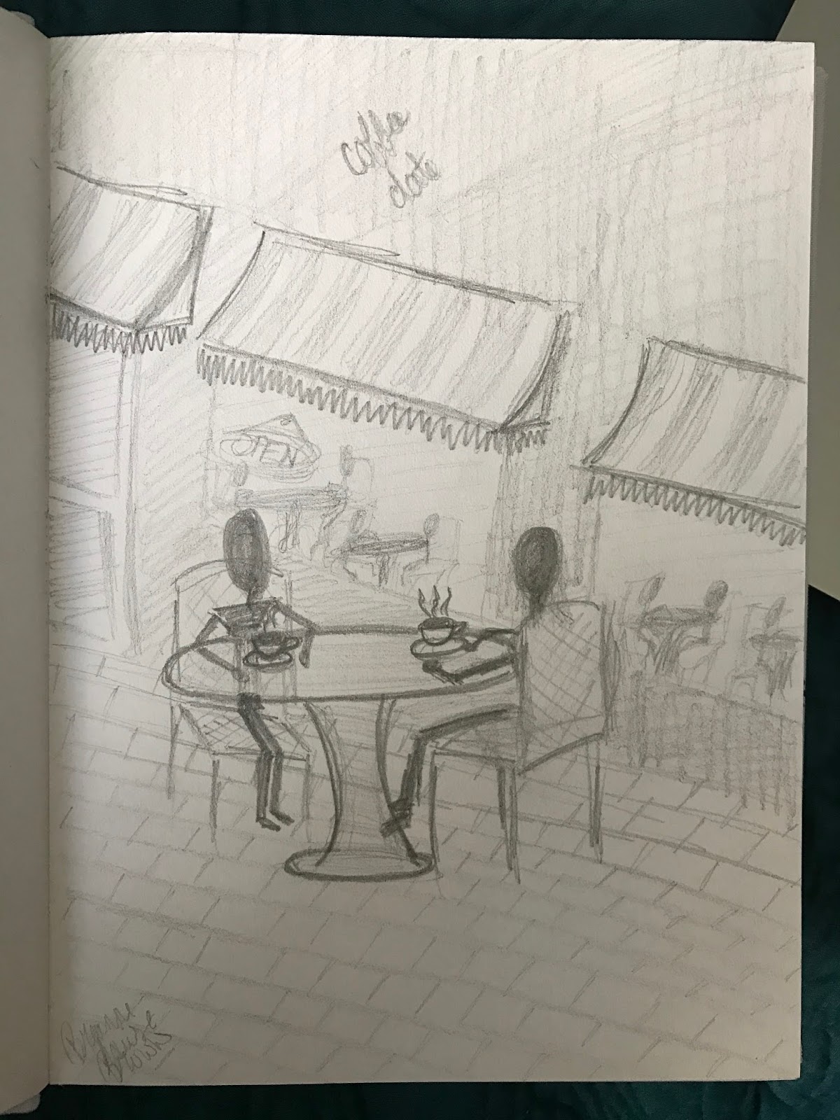
Also, because I always end posts with a video or image, and don't have one that pertains to this post, here is a picture of a doodle that I made over the summer.


Monday, September 26, 2016

L'elisir d'amore (An Elixir of Love)

For this assignment, I had to watch an opera written before 1920 and write a three page paper.  The paper had to answer the following:

What did you discover watching this opera?

How do you think audiences reacted to it when it was originally presented?

Why do you think this piece is important in the chronology of opera?

How is technology used in it?

If you were a twenty-first century director, how would you turn this piece into a video game?

If I'm being honest, the two hours I spent watching this opera were probably two of the most boring hours of my life.  The entire performance was in Italian, so I had no clue what the characters were saying, and I had to basically guess what was going on.  After I finished watching the opera, I went to Google and used this site to get a summary of the opera and are sure I understood it.  
The video I watched is at the end of this post.  If you're interested, you can watch it.  If you ask my honest opinion, I wouldn't waste my time watching it.  I just felt I should attach it so you knew which specific performance my paper is based off of.

To read my paper, click here, or follow the link:


Tuesday, September 20, 2016

COM222 Redesigned Website

In my COM222 class, after creating a new mascot for UT, we were asked to redesign the UT website.
The current website is extremely user friendly if you are a new student who is applying to UT, but not so user friendly if you are a current student trying to find anything.
What I have done is essentially created two separate home pages for the website.  In my version of the website, when a person goes to ut.edu, the first picture shown is what will appear.  Basically, you will click either "NEW STUDENT" if you are applying to the college, or "RETURNING STUDENT/FACULTY" if you are currently enrolled in the university, or are a faculty member.  On the bottom of this page are links to UT's Facebook, Twitter, and Instagram pages, along with the most recent posts on each.  In the background is an image of the minaret, which is an iconic image in association with UT.
With my redesigned webs, by clicking the "NEW STUDENT" option, you will be redirected to the current UT website, as it is currently user friendly if you are applying to the college.
However, by clicking the "RETURNING STUDENT/FACULTY" option, you will be directed to a new home page.  An example is shown by the second picture.  Essentially all of the content is the same, it is just presented in a way that is easier to navigate.  Along the top of the screen are quick links to direct students to Blackboard, student email, and SpartanWeb.  Down the left side of the page is a menu with different categories.  All of these categories are somewhere on the current website, they just aren't as easily accessible.  By clicking on one of the categories in the menu, that specific page pops up, along with all of its content and any links associated with it.  In my example, I have the "Campus Life" tab selected, and as you can see, all of the information that has to do with campus life appears on the page.  Subsections of "Campus Life" are listed below the heading, and if students click on one (for example, "Student Services") they would be brought to that section of the page.
Any forms or other links associated with a certain category or subcategory appear in red and will open a new tab bringing you to the page associated with that link.
There is also a search bar located at the top of the page for quick searches, which can be used instead of the menu.

To check out UT's current website, click here

New Home Page

Returning Student/Faculty Page

Monday, September 19, 2016

Madama Butterfly

In class, we have been discussing Opera, and were assigned to watch a Madama Butterfly animation, and to leave our comments here on our blogs, so here are my thoughts:

This animation is beautiful and tragic.  The Opera music provides a sense of emotion that allows viewers to know how the main character feels throughout the story.  I can't help but feel sorry for the main character.  She gave everything to a man, got pregnant with his child, raised her child, and when he arrived home from war, he takes their child to raise with his new wife.
In the animation, with the rises and falls in the music, you are able to feel what the woman is feeling, and you can sense the pain that she is going through.
I also thought it was genius for the animators to physically show the damage done to this woman.  All while raising her child, the mother and daughter have a connection that is shown through a rope connecting their hearts.  When the father returns home, he takes the child and brings her to his wife, and physically breaks the rope, literally tearing the mother from her child.
After this, the woman runs away into the darkness, and tears herself apart, quite literally.  She tears her skin off, and then proceeds to break her insides.
While all of this is happening, the Opera music is rising and falling with the emotions of the woman.  This animation was a beautiful tragedy.


Wednesday, September 14, 2016

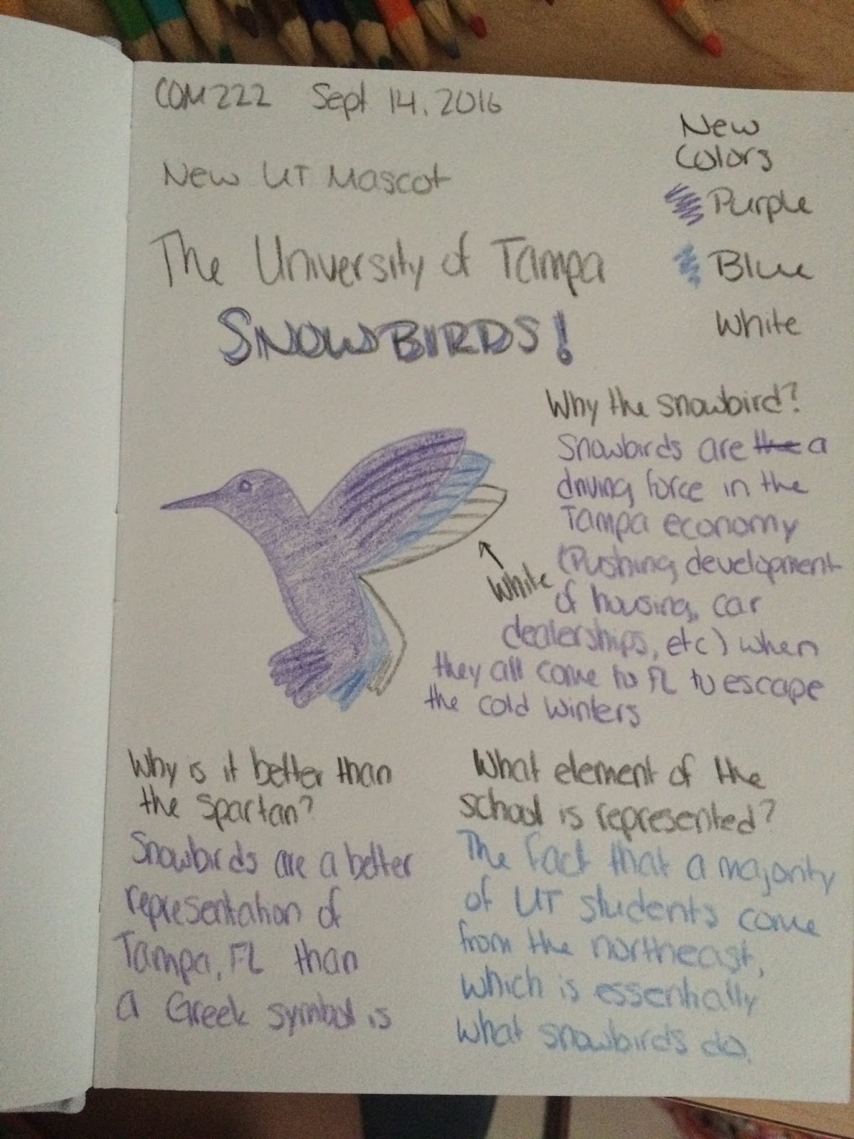
COM222 New UT Mascot

For my COM222 class, I was assigned to come up with a new mascot for the University of Tampa, and in doing so, answer the following questions:

1. Why did you chose this mascot?
2. Why is this mascot better than our current mascot, the Spartan?
3. What element of UT is represented by this new mascot?

And so, I present to you, the University of Tampa Snowbirds!
The answers to the questions are written on the page, but I will also type them out here in case you can't read them.  Plus, there's a lot going on on the page, so typing it out might make it easier to read.

1. Why did you chose this mascot?
Snowbirds are a driving force in the Tampa economy (pushing development of housing, car dealerships, etc.) when they all come down to Florida to escape the harsh cold of northern winters.

2. Why is this mascot better than our current mascot, the Spartan?
Snowbirds are a better representation of Tampa, Florida because all the snowbirds from up north find there way south for the winter year after year, rather than a Greek symbol that has nothing to do with Tampa whatsoever.

3. What element of UT is represented by this new mascot?
The snowbird is symbolic of the fact that a majority of UT students are from the northeast, and they traveled south to Tampa, Florida, which is essentially what snowbirds do.

I have also decided with the change of our mascot to change our school colors as well.  Purple, blue, and white are just better colors for a snowbird than red, yellow, and black.

I hope you all find the humor in this like I do.
GO SNOWBIRDS!


Tuesday, September 13, 2016

Art Vs Design

After reading Art Vs Design, I am in agreement with the fact that if an artist creates a piece that is a replica of past artists, they are simply a designer.  Art should be individual and unique.  If I am an artist, I want to convey my message in a way that is unique to me.
However, I also feel that it is okay to take some influence from past artists.  For example, in my final project for my ART204 class last semester, my entire project was inspired by Andy Warhol (although, the project was to mimic another artists).  If that were not the project, though, I feel that there is nothing wrong with me creating a piece that hints at inspiration from Andy Warhol, so long as I am not completely copying his style, as I did in this project.
In my opinion, artists are designers, and designers are artists, and there is a blurry line that separates the two.  If you would like to check out the article for yourself, the link is in the beginning of this post, or you can simply click here.
And, as I have discussed it in this post, I leave you with a picture of my final ART204 project, because it would be a shame to mention it and not show it off.


RAUL CUERO’s Interview About Creativity

For my next assignment, I had to watch Raul Cuero's interview about creativity.
This video was interesting, but honestly there were only a few key points that sparked my interest.
The fact the Dr. Raul Cuero came from nothing, yet still became a successful scientist is interesting to me, but more interesting is how he did it.  When he was discussing his college career, and how he was able to attend college due to a basketball scholarship, I was honestly not surprised that he said he was discriminated against, and thought of as 'less than' when he was off the basketball court and instead in the classroom.
But what I loved about his response to this, was that when others told him he was wrong, he took that comment not as a negative, but as a positive.  He used that comment of people telling him he was doing something wrong, and instead of letting it tear him down, he used it as inspiration to try and do better.  It is inspiring how he used what is normally thought of as a demeaning comment to build himself up.
The second comment he made that I agree with was his statement about children playing and connecting with one another.  In today's society, children area playing more with video games and computer screens than with toys and each other.  The fact that children are losing this interaction is damaging our society, because, as Dr. Cuero stated, ideas are formed in nature, not through a screen.  When children are playing with toys and talking to one another, they are forming ideas and building off of one another.  When children are staring at a screen during 'play time' the ideas are being lost.
The final argument that Dr. Raul Cuero makes that I agree with is the problem he has with the American educational system.  In the American education system today, we are teaching children to get jobs.  We are not teaching children in order for them to gain knowledge.  The problem with this is that now, children are focused on getting through school to get their degree to get a job to make money to send their children to school to get a degree to get a job to make money...It's an endless cycle.  If you instead teach children simply for the purpose of gaining knowledge, they will not turn into a product of the cycle.
The rest of what Dr. Cuero had to say, while important, honestly did not capture my attention all that much.  If you would like to check out the video for yourself, I have attached it below.